
[ad_1]
Clustering of Twitter data with Python, K-Means, and t-SNE

In the article “What People Write about Climate” I analyzed Twitter posts using natural language processing, vectorization, and clustering. Using this technique, it is possible to find distinct groups in unstructured text data, for example, to extract messages about ice melting or about electric transport from thousands of tweets about climate. During the processing of this data, another question arose: what if we could apply the same algorithm not to the messages themselves but to the time when those messages were published? This will allow us to analyze when and how often different people make posts on social media. It can be important not only from sociological or psychological perspectives but, as we will see later, also for detecting bots or users sending spam. Last but not least, almost everybody is using social platforms nowadays, and it is just interesting to learn something new about us. Obviously, the same algorithm can be used not only for Twitter posts but for any media platform.
Methodology
I will use mostly the same approach as described in the first part about Twitter data analysis. Our data processing pipeline will consist of several steps:
- Collecting tweets including the specific hashtag and saving them in a CSV file. This was already done in the previous article, so I will skip the details here.
- Finding the general properties of the collected data.
- Calculating embedding vectors for each user based on the time of their posts.
- Clustering the data using the K-Means algorithm.
- Analyzing the results.
Let’s get started.
1. Loading the data
I will be using the Tweepy library to collect Twitter posts. More details can be found in the first part; here I will only publish the source code:
import tweepyapi_key = "YjKdgxk..."
api_key_secret = "Qa6ZnPs0vdp4X...."
auth = tweepy.OAuth2AppHandler(api_key, api_key_secret)
api = tweepy.API(auth, wait_on_rate_limit=True)
hashtag = "#climate"
language = "en"
def text_filter(s_data: str) -> str:
""" Remove extra characters from text """
return s_data.replace("&", "and").replace(";", " ").replace(",", " ") \
.replace('"', " ").replace("\n", " ").replace(" ", " ")
def get_hashtags(tweet) -> str:
""" Parse retweeted data """
hash_tags = ""
if 'hashtags' in tweet.entities:
hash_tags = ','.join(map(lambda x: x["text"], tweet.entities['hashtags']))
return hash_tags
def get_csv_header() -> str:
""" CSV header """
return "id;created_at;user_name;user_location;user_followers_count;user_friends_count;retweets_count;favorites_count;retweet_orig_id;retweet_orig_user;hash_tags;full_text"
def tweet_to_csv(tweet):
""" Convert a tweet data to the CSV string """
if not hasattr(tweet, 'retweeted_status'):
full_text = text_filter(tweet.full_text)
hasgtags = get_hashtags(tweet)
retweet_orig_id = ""
retweet_orig_user = ""
favs, retweets = tweet.favorite_count, tweet.retweet_count
else:
retweet = tweet.retweeted_status
retweet_orig_id = retweet.id
retweet_orig_user = retweet.user.screen_name
full_text = text_filter(retweet.full_text)
hasgtags = get_hashtags(retweet)
favs, retweets = retweet.favorite_count, retweet.retweet_count
s_out = f"tweet.id;tweet.created_at;tweet.user.screen_name;addr_filter(tweet.user.location);tweet.user.followers_count;tweet.user.friends_count;retweets;favs;retweet_orig_id;retweet_orig_user;hasgtags;full_text"
return s_out
if __name__ == "__main__":
pages = tweepy.Cursor(api.search_tweets, q=hashtag, tweet_mode='extended',
result_type="recent",
count=100,
lang=language).pages(limit)
with open("tweets.csv", "a", encoding="utf-8") as f_log:
f_log.write(get_csv_header() + "\n")
for ind, page in enumerate(pages):
for tweet in page:
# Get data per tweet
str_line = tweet_to_csv(tweet)
# Save to CSV
f_log.write(str_line + "\n")
Using this code, we can get all Twitter posts with a specific hashtag, made within the last 7 days. A hashtag is actually our search query, we can find posts about climate, politics, or any other topic. Optionally, a language code allows us to search posts in different languages. Readers are welcome to do extra research on their own; for example, it can be interesting to compare the results between English and Spanish tweets.
After the CSV file is saved, let’s load it into the dataframe, drop the unwanted columns, and see what kind of data we have:
import pandas as pddf = pd.read_csv("climate.csv", sep=';', dtype='id': object, 'retweet_orig_id': object, 'full_text': str, 'hash_tags': str, parse_dates=["created_at"], lineterminator='\n')
df.drop(["retweet_orig_id", "user_friends_count", "retweets_count", "favorites_count", "user_location", "hash_tags", "retweet_orig_user", "user_followers_count"], inplace=True, axis=1)
df = df.drop_duplicates('id')
with pd.option_context('display.max_colwidth', 80):
display(df)
In the same way, as in the first part, I was getting Twitter posts with the hashtag “#climate”. The result looks like this:

We actually don’t need the text or user id, but it can be useful for “debugging”, to see how the original tweet looks. For future processing, we will need to know the day, time, and hour of each tweet. Let’s add columns to the dataframe:
def get_time(dt: datetime.datetime):
""" Get time and minute from datetime """
return dt.time()def get_date(dt: datetime.datetime):
""" Get date from datetime """
return dt.date()
def get_hour(dt: datetime.datetime):
""" Get time and minute from datetime """
return dt.hour
df["date"] = df['created_at'].map(get_date)
df["time"] = df['created_at'].map(get_time)
df["hour"] = df['created_at'].map(get_hour)
We can easily verify the results:
display(df[["user_name", "date", "time", "hour"]])

Now we have all the needed information, and we are ready to go.
2. General Insights
As we could see from the last screenshot, 199,278 messages were loaded; those are messages with a “#Climate” hashtag, which I collected within several weeks. As a warm-up, let’s answer a simple question: how many messages per day about climate were people posting on average?
First, let’s calculate the total number of days and the total number of users:
days_total = df['date'].unique().shape[0]
print(days_total)
# > 46users_total = df['user_name'].unique().shape[0]
print(users_total)
# > 79985
As we can see, the data was collected over 46 days, and in total, 79,985 Twitter users posted (or reposted) at least one message with the hashtag “#Climate” during that time. Obviously, we can only count users who made at least one post; alas, we cannot get the number of readers this way.
Let’s find the number of messages per day for each user. First, let’s group the dataframe by user name:
gr_messages_per_user = df.groupby(['user_name'], as_index=False).size().sort_values(by=['size'], ascending=False)
gr_messages_per_user["size_per_day"] = gr_messages_per_user['size'].div(days_total)
The “size” column gives us the number of messages every user sent. I also added the “size_per_day” column, which is easy to calculate by dividing the total number of messages by the total number of days. The result looks like this:

We can see that the most active users are posting up to 18 messages per day, and the most inactive users posted only 1 message within this 46-day period (1/46 = 0,0217). Let’s draw a histogram using NumPy and Bokeh:
import numpy as np
from bokeh.io import show, output_notebook, export_png
from bokeh.plotting import figure, output_file
from bokeh.models import ColumnDataSource, LabelSet, Whisker
from bokeh.transform import factor_cmap, factor_mark, cumsum
from bokeh.palettes import *
output_notebook()users = gr_messages_per_user['user_name']
amount = gr_messages_per_user['size_per_day']
hist_e, edges_e = np.histogram(amount, density=False, bins=100)
# Draw
p = figure(width=1600, height=500, title="Messages per day distribution")
p.quad(top=hist_e, bottom=0, left=edges_e[:-1], right=edges_e[1:], line_color="darkblue")
p.x_range.start = 0
# p.x_range.end = 150000
p.y_range.start = 0
p.xaxis[0].ticker.desired_num_ticks = 20
p.left[0].formatter.use_scientific = False
p.below[0].formatter.use_scientific = False
p.xaxis.axis_label = "Messages per day, avg"
p.yaxis.axis_label = "Amount of users"
show(p)
The output looks like this:

Interestingly, we can see only one bar. Of all 79,985 users who posted messages with the “#Climate” hashtag, almost all of them (77,275 users) sent, on average, less than a message per day. It looks surprising at first glance, but actually, how often do we post tweets about the climate? Honestly, I never did it in all my life. We need to zoom the graph a lot to see other bars on the histogram:

Only with this zoom level can we see that among all 79,985 Twitter users who posted something about “#Climate”, there are less than 100 “activists”, posting messages every day! Ok, maybe “climate” is not something people are making posts about daily, but is it the same with other topics? I created a helper function, returning the percentage of “active” users who posted more than N messages per day:
def get_active_users_percent(df_in: pd.DataFrame, messages_per_day_threshold: int):
""" Get percentage of active users with a messages-per-day threshold """
days_total = df_in['date'].unique().shape[0]
users_total = df_in['user_name'].unique().shape[0]
gr_messages_per_user = df_in.groupby(['user_name'], as_index=False).size()
gr_messages_per_user["size_per_day"] = gr_messages_per_user['size'].div(days_total)
users_active = gr_messages_per_user[gr_messages_per_user['size_per_day'] >= messages_per_day_threshold].shape[0]
return 100*users_active/users_total
Then, using the same Tweepy code, I downloaded data frames for 6 topics from different domains. We can draw results with Bokeh:
labels = ['#Climate', '#Politics', '#Cats', '#Humour', '#Space', '#War']
counts = [get_active_users_percent(df_climate, messages_per_day_threshold=1),
get_active_users_percent(df_politics, messages_per_day_threshold=1),
get_active_users_percent(df_cats, messages_per_day_threshold=1),
get_active_users_percent(df_humour, messages_per_day_threshold=1),
get_active_users_percent(df_space, messages_per_day_threshold=1),
get_active_users_percent(df_war, messages_per_day_threshold=1)]palette = Spectral6
source = ColumnDataSource(data=dict(labels=labels, counts=counts, color=palette))
p = figure(width=1200, height=400, x_range=labels, y_range=(0,9),
title="Percentage of Twitter users posting 1 or more messages per day",
toolbar_location=None, tools="")
p.vbar(x='labels', top='counts', width=0.9, color='color', source=source)
p.xgrid.grid_line_color = None
p.y_range.start = 0
show(p)
The results are interesting:

The most popular hashtag here is “#Cats”. In this group, about 6.6% of users make posts daily. Are their cats just adorable, and they cannot resist the temptation? On the contrary, “#Humour” is a popular topic with a large number of messages, but the number of people who post more than one message per day is minimal. On more serious topics like “#War” or “#Politics”, about 1.5% of users make posts daily. And surprisingly, much more people are making daily posts about “#Space” compared to “#Humour”.
To clarify these digits in more detail, let’s find the distribution of the number of messages per user; it is not directly relevant to message time, but it is still interesting to find the answer:
def get_cumulative_percents_distribution(df_in: pd.DataFrame, steps=200):
""" Get a distribution of total percent of messages sent by percent of users """
# Group dataframe by user name and sort by amount of messages
df_messages_per_user = df_in.groupby(['user_name'], as_index=False).size().sort_values(by=['size'], ascending=False)
users_total = df_messages_per_user.shape[0]
messages_total = df_messages_per_user["size"].sum()# Get cumulative messages/users ratio
messages = []
percentage = np.arange(0, 100, 0.05)
for perc in percentage:
msg_count = df_messages_per_user[:int(perc*users_total/100)]["size"].sum()
messages.append(100*msg_count/messages_total)
return percentage, messages
This method calculates the total number of messages posted by the most active users. The number itself can strongly vary for different topics, so I use percentages as both outputs. With this function, we can compare results for different hashtags:
# Calculate
percentage, messages1 = get_cumulative_percent(df_climate)
_, messages2 = get_cumulative_percent(df_politics)
_, messages3 = get_cumulative_percent(df_cats)
_, messages4 = get_cumulative_percent(df_humour)
_, messages5 = get_cumulative_percent(df_space)
_, messages6 = get_cumulative_percent(df_war)labels = ['#Climate', '#Politics', '#Cats', '#Humour', '#Space', '#War']
messages = [messages1, messages2, messages3, messages4, messages5, messages6]
# Draw
palette = Spectral6
p = figure(width=1200, height=400,
title="Twitter messages per user percentage ratio",
x_axis_label='Percentage of users',
y_axis_label='Percentage of messages')
for ind in range(6):
p.line(percentage, messages[ind], line_width=2, color=palette[ind], legend_label=labels[ind])
p.x_range.end = 100
p.y_range.start = 0
p.y_range.end = 100
p.xaxis.ticker.desired_num_ticks = 10
p.legend.location = 'bottom_right'
p.toolbar_location = None
show(p)
Because both axes are “normalized” to 0..100%, it is easy to compare results for different topics:

Again, the result looks interesting. We can see that the distribution is strongly skewed: 10% of the most active users are posting 50–60% of the messages (spoiler alert: as we will see soon, not all of them are humans;).
This graph was made by a function that is only about 20 lines of code. This “analysis” is pretty simple, but many additional questions can arise. There is a distinct difference between different topics, and finding the answer to why it is so is obviously not straightforward. Which topics have the largest number of active users? Are there cultural or regional differences, and is the curve the same in different countries, like the US, Russia, or Japan? I encourage readers to do some tests on their own.
Now that we’ve got some basic insights, it’s time to do something more challenging. Let’s cluster all users and try to find some common patterns. To do this, first, we will need to convert the user’s data into embedding vectors.
3. Making User Embeddings
An embedded vector is a list of numbers that represents the data for each user. In the previous article, I got embedding vectors from tweet words and sentences. Now, because I want to find patterns in the “temporal” domain, I will calculate embeddings based on the message time. But first, let’s find out what the data looks like.
As a reminder, we have a dataframe with all tweets, collected for a specific hashtag. Each tweet has a user name, creation date, time, and hour:

Let’s create a helper function to show all tweet times for a specific user:
def draw_user_timeline(df_in: pd.DataFrame, user_name: str):
""" Draw cumulative messages time for specific user """
df_u = df_in[df_in["user_name"] == user_name]
days_total = df_u['date'].unique().shape[0]# Group messages by time of the day
messages_per_day = df_u.groupby(['time'], as_index=False).size()
msg_time = messages_per_day['time']
msg_count = messages_per_day['size']
# Draw
p = figure(x_axis_type='datetime', width=1600, height=150, title=f"Cumulative tweets timeline during days_total days: user_name")
p.vbar(x=msg_time, top=msg_count, width=datetime.timedelta(seconds=30), line_color='black')
p.xaxis[0].ticker.desired_num_ticks = 30
p.xgrid.grid_line_color = None
p.toolbar_location = None
p.x_range.start = datetime.time(0,0,0)
p.x_range.end = datetime.time(23,59,0)
p.y_range.start = 0
p.y_range.end = 1
show(p)
draw_user_timeline(df, user_name="UserNameHere")
...
The result looks like this:

Here we can see messages made by some users within several weeks, displayed on the 00–24h timeline. We may already see some patterns here, but as it turned out, there is one problem. The Twitter API does not return a time zone. There is a “timezone” field in the message body, but it is always empty. Maybe when we see tweets in the browser, we see them in our local time; in this case, the original timezone is just not important. Or maybe it is a limitation of the free account. Anyway, we cannot cluster the data properly if one user from the US starts sending messages at 2 AM UTC and another user from India starts sending messages at 13 PM UTC; both timelines just will not match together.
As a workaround, I tried to “estimate” the timezone myself by using a simple empirical rule: most people are sleeping at night, and highly likely, they are not posting tweets at that time 😉 So, we can find the 9-hour interval, where the average number of messages is minimal, and assume that this is a “night” time for that user.
def get_night_offset(hours: List):
""" Estimate the night position by calculating the rolling average minimum """
night_len = 9
min_pos, min_avg = 0, 99999
# Find the minimum position
data = np.array(hours + hours)
for p in range(24):
avg = np.average(data[p:p + night_len])
if avg <= min_avg:
min_avg = avg
min_pos = p# Move the position right if possible (in case of long sequence of similar numbers)
for p in range(min_pos, len(data) - night_len):
avg = np.average(data[p:p + night_len])
if avg <= min_avg:
min_avg = avg
min_pos = p
else:
break
return min_pos % 24
def normalize(hours: List):
""" Move the hours array to the right, keeping the 'night' time at the left """
offset = get_night_offset(hours)
data = hours + hours
return data[offset:offset+24]
Practically, it works well in cases like this, where the “night” period can be easily detected:

Of course, some people wake up at 7 AM and some at 10 AM, and without a time zone, we cannot find it. Anyway, it’s better than nothing, and as a “baseline”, this algorithm can be used.
Obviously, the algorithm does not work in cases like that:

In this example, we just don’t know if this user was posting messages in the morning, in the evening, or after lunch; there is no information about that. But it is still interesting to see that some users are posting messages only at a specific time of the day. In this case, having a “virtual offset” is still helpful; it allows us to “align” all user timelines, as we will see soon in the results.
Now let’s calculate the embedding vectors. There can be different ways of doing this. I decided to use vectors in the form of [SumTotal, Sum00,.., Sum23], where SumTotal is the total amount of messages made by a user, and Sum00..Sum23 are the total number of messages made by each hour of the day. We can use Panda’s groupby method with two parameters “user_name” and “hour”, which does almost all the needed calculations for us:
def get_vectorized_users(df_in: pd.DataFrame):
""" Get embedding vectors for all users
Embedding format: [total hours, total messages per hour-00, 01, .. 23]
"""
gr_messages_per_user = df_in.groupby(['user_name', 'hour'], as_index=True).size()vectors = []
users = gr_messages_per_user.index.get_level_values('user_name').unique().values
for ind, user in enumerate(users):
if ind % 10000 == 0:
print(f"Processing ind of users.shape[0]")
hours_all = [0]*24
for hr, value in gr_messages_per_user[user].items():
hours_all[hr] = value
hours_norm = normalize(hours_all)
vectors.append([sum(hours_norm)] + hours_norm)
return users, np.asarray(vectors)
all_users, vectorized_users = get_vectorized_users(df)
Here, the “get_vectorized_users” method is doing the calculation. After calculating each 00..24h vector, I use the “normalize” function to apply the “timezone” offset, as was described before.
Practically, the embedding vector for a relatively active user may look like this:
[120 0 0 0 0 0 0 0 0 0 1 2 0 2 2 1 0 0 0 0 0 18 44 50 0]
Here 120 is the total number of messages, and the rest is a 24-digit array with the number of messages made within every hour (as a reminder, in our case, the data was collected within 46 days). For the inactive user, the embedding may look like this:
[4 0 0 0 0 0 0 0 0 0 1 0 0 0 0 0 0 0 1 1 1 0 0 0 0]
Different embedding vectors can also be created, and a more complicated scheme can provide better results. For example, it may be interesting to add a total number of “active” hours per day or to include a day of the week into the vector to see how the user’s activity varies between working days and weekends, and so on.
4. Clustering
As in the previous article, I will be using the K-Means algorithm to find the clusters. First, let’s find the optimum K-value using the Elbow method:
import matplotlib.pyplot as plt
%matplotlib inlinedef graw_elbow_graph(x: np.array, k1: int, k2: int, k3: int):
k_values, inertia_values = [], []
for k in range(k1, k2, k3):
print("Processing:", k)
km = KMeans(n_clusters=k).fit(x)
k_values.append(k)
inertia_values.append(km.inertia_)
plt.figure(figsize=(12,4))
plt.plot(k_values, inertia_values, 'o')
plt.title('Inertia for each K')
plt.xlabel('K')
plt.ylabel('Inertia')
graw_elbow_graph(vectorized_users, 2, 20, 1)
The result looks like this:

Let’s write the method to calculate the clusters and draw the timelines for some users:
def get_clusters_kmeans(x, k):
""" Get clusters using K-Means """
km = KMeans(n_clusters=k).fit(x)
s_score = silhouette_score(x, km.labels_)
print(f"K=k: Silhouette coefficient s_score:0.2f, inertia:km.inertia_")sample_silhouette_values = silhouette_samples(x, km.labels_)
silhouette_values = []
for i in range(k):
cluster_values = sample_silhouette_values[km.labels_ == i]
silhouette_values.append((i, cluster_values.shape[0], cluster_values.mean(), cluster_values.min(), cluster_values.max()))
silhouette_values = sorted(silhouette_values, key=lambda tup: tup[2], reverse=True)
for s in silhouette_values:
print(f"Cluster s[0]: Size:s[1], avg:s[2]:.2f, min:s[3]:.2f, max: s[4]:.2f")
print()
# Create new dataframe
data_len = x.shape[0]
cdf = pd.DataFrame(
"id": all_users,
"vector": [str(v) for v in vectorized_users],
"cluster": km.labels_,
)
# Show top clusters
for cl in silhouette_values[:10]:
df_c = cdf[cdf['cluster'] == cl[0]]
# Show cluster
print("Cluster:", cl[0], cl[2])
with pd.option_context('display.max_colwidth', None):
display(df_c[["id", "vector"]][:20])
# Show first users
for user in df_c["id"].values[:10]:
draw_user_timeline(df, user_name=user)
print()
return km.labels_
clusters = get_clusters_kmeans(vectorized_users, k=5)
This method is mostly the same as in the previous part; the only difference is that I draw user timelines for each cluster instead of a cloud of words.
5. Results
Finally, we are ready to see the results. Obviously, not all groups were perfectly separated, but some of the categories are interesting to mention. As a reminder, I was analyzing all tweets of users who made posts with the “#Climate” hashtag within 46 days. So, what clusters can we see in posts about climate?
“Inactive” users, who sent only 1–2 messages within a month. This group is the largest; as was discussed above, it represents more than 95% of all users. And the K-Means algorithm was able to detect this cluster as the largest one. Timelines for those users look like this:

“Interested” users. These users posted tweets every 2–5 days, so I can assume that they have at least some sort of interest in this topic.

“Active” users. These users are posting more than several messages per day:

We don’t know if those people are just “activists” or if they regularly post tweets as a part of their job, but at least we can see that their online activity is pretty high.
“Bots”. These users are highly unlikely to be humans at all. Not surprisingly, they have the highest number of posted messages. Of course, I have no 100% proof that all those accounts belong to bots, but it is unlikely that any human can post messages so regularly without rest and sleep:

The second “user”, for example, is posting tweets at the same time of day with 1-second accuracy; its tweets can be used as an NTP server 🙂
By the way, some other “users” are not really active, but their timeline looks suspicious. This “user” has not so many messages, and there is a visible “day/night” pattern, so it was not clustered as a “bot”. But for me, it looks unrealistic that an ordinary user can publish messages strictly at the beginning of each hour:

Maybe the auto-correlation function can provide good results in detecting all users with suspiciously repetitive activity.
“Clones”. If we run a K-Means algorithm with higher values of K, we can also detect some “clones”. These clusters have identical time patterns and the highest silhouette values. For example, we can see several accounts with similar-looking nicknames that only differ in the last characters. Probably, the script is posting messages from several accounts in parallel:

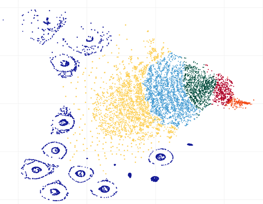
As a last step, we can see clusters visualization, made by the t-SNE (t-distributed Stochastic Neighbor Embedding) algorithm, which looks pretty beautiful:

Here we can see a lot of smaller clusters that were not detected by the K-Means with K=5. In this case, it makes sense to try higher K values; maybe another algorithm like DBSCAN (Density-based spatial clustering of applications with noise) will also provide good results.
Conclusion
Using data clustering, we were able to find distinctive patterns in tens of thousands of tweets about “#Climate”, made by different users. The analysis itself was made only by using the time of tweet posts. This can be useful in sociology or cultural anthropology studies; for example, we can compare the online activity of different users on different topics, figure out how often they make social network posts, and so on. Time analysis is language-agnostic, so it is also possible to compare results from different geographical areas, for example, online activity between English- and Japanese-speaking users. Time-based data can also be useful in psychology or medicine; for example, it is possible to figure out how many hours people are spending on social networks or how often they make pauses. And as was demonstrated above, finding patterns in users “behavior” can be useful not only for research purposes but also for purely “practical” tasks like detecting bots, “clones”, or users posting spam.
Alas, not all analysis was successful because the Twitter API does not provide timezone data. For example, it would be interesting to see if people are posting more messages in the morning or in the evening, but without having a proper time, it is impossible; all messages returned by the Twitter API are in UTC time. But anyway, it is great that the Twitter API allows us to get large amounts of data even with a free account. And obviously, the ideas described in this post can be used not only for Twitter but for other social networks as well.
If you enjoyed this story, feel free to subscribe to Medium, and you will get notifications when my new articles will be published, as well as full access to thousands of stories from other authors.
Thanks for reading.
[ad_2]
Source link